In a recent project, I’ve started to use Office UI Fabric as component library for a React application. This is an interesting piece of Microsoft work - who knew they would ever create open source React components?
The components are well made, but the documentation is lagging behind in good examples, a bit like the MSDN documentation - full of property specifications, but few fully fledged examples.
One neat piece of functionality when working with themes for Office UI Fabric is the Theme Generator. It gives you the possibility to specify your colours of choice and see the theme generated shades.
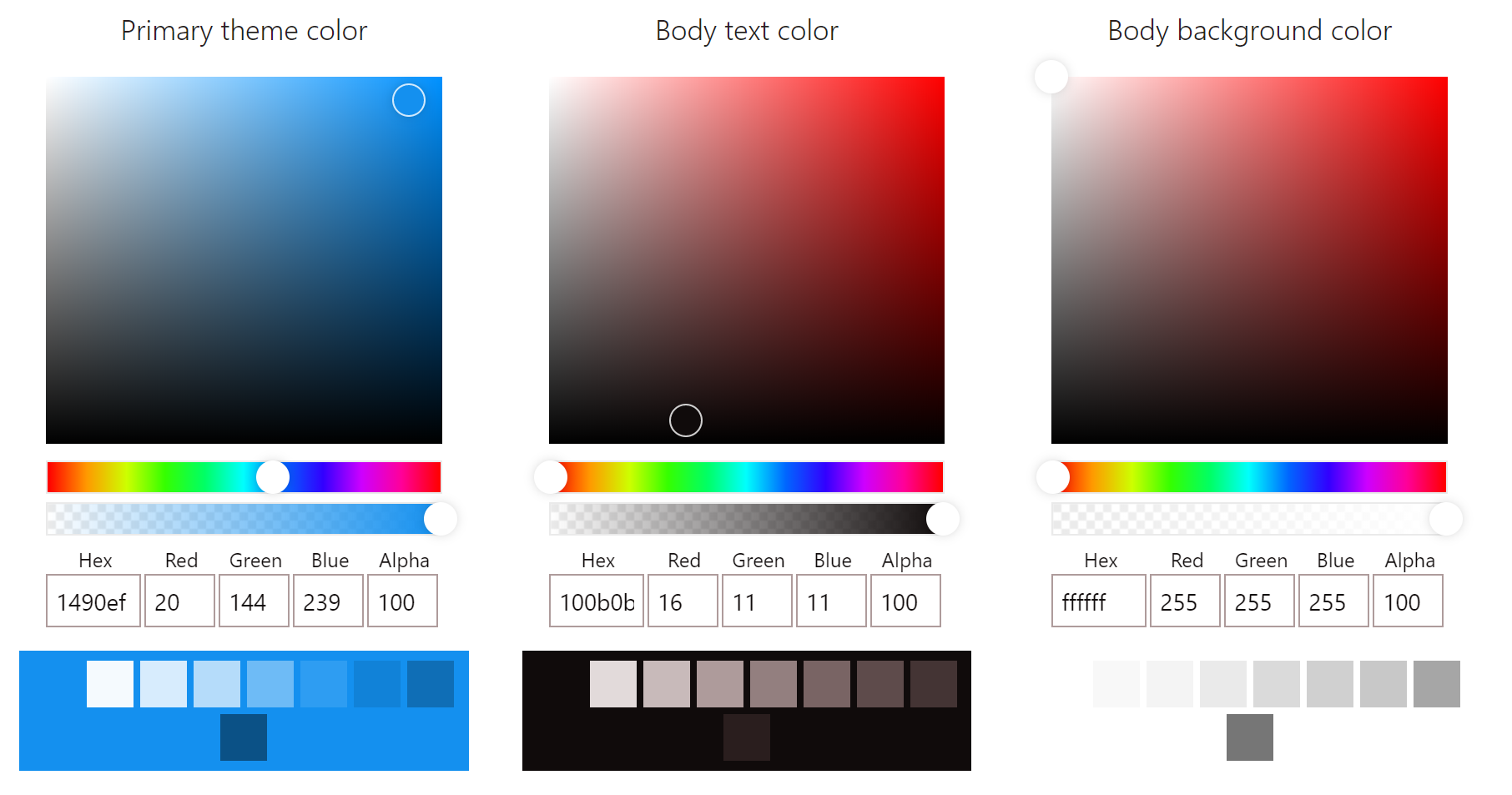
If I were to wish for something here it would be the possibility to define a secondary colour as well to create a complementary matching pair based on the colour wheel. However, that’s not how this theme works and you’re stuck with a monochromatic solution. The focus of this component library is to be functional and simplistic - something it does succeed well with.
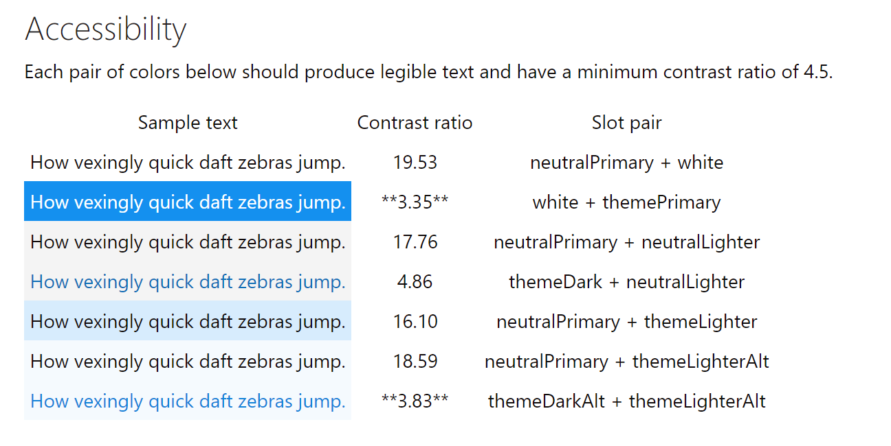
The colours you’ve chosen are also analysed based upon how well they work together. A contrast ratio of less than 4.5 is pointed out and you are recommended to go back to the colour selection to pick other colours.
The theme generator produces different outputs for you to use, but for embedding themes into React applications the JSON option is the best. In the official documentation you can read about how themes can be imported and used. However, something is wrong in their examples, it just doesn’t work. Instead I had to do in the following way.
 1
 2
 3
 4
 5
 6
 7
 8
 9
10
11
12
13
14
15
16
17
18
19
20
21
22
23
24
25
26
27
28
29
30
31
32
33
34
35
36
37
38
39
40
41
42
43
44
45
46
47
48
49
50
51
52
53
54
55
56
57
58
59
60
61
62
63
|
import { getTheme, loadTheme } from '@uifabric/styling';
import * as React from 'react';

loadTheme({
  palette: {
    "themePrimary": "#1490ef",
    "themeLighterAlt": "#f5fafe",
    "themeLighter": "#d7ecfd"
  }
});

class App extends React.Component {
  private theme = getTheme();

  public render() {
    return (
      <div className="App">
        <h1 style={\{color: this.theme.palette.themePrimary} }>It works</h1>
      </div>
    );
  }
}
export default App;
```

One important step here is that `getTheme()` is called inside a component. It doesn't necessarily have to, but the order in which things are called make a difference and `loadTheme()` has to be called before you call `getTheme()`. When all files are merged together, it's not easy to know in what order things are being loaded. But when you put the call inside the component, then you know for sure it'll happen after `loadTheme()` has been called.

These theme details, including other Office UI Fabric configurations, can then also be used if you need to integrate with styling frameworks like [Glamor](https://github.com/threepointone/glamor) or [Aphrodite](https://github.com/Khan/aphrodite).

The example below shows how an Aphrodite style can include pre-defined font styles as well as theme colours. Notice how the font is a collection of settings and has to be added using the spread operator.

```csharp
import * as React from 'react';
import { getTheme } from "@uifabric/styling";
import { StyleSheet, css } from 'aphrodite';

export const createStyles = () =>
{
  const theme = getTheme();

  return StyleSheet.create({
    header: {
      ...(theme.fonts.xxLarge as any),
      backgroundColor: theme.palette.themePrimary,
      color: theme.palette.white,
      padding: '20px'
    }
  })
}

export class HeaderComponent extends React.Component {
  private styles = createStyles();
  public render() {
    return (
      <header className={css(this.styles.header)}>
        Header for page
      </header>
    );
  }
}
```

There are many ways to structure your embedded CSS styles. By creating a separate `createStyles()` function you can easily separate it into its own style file, if you prefer such structure.
|