The Flexbox CSS styling of web sites is gaining more and more popularity. This post is not a complete overview of what you can do with flexbox but rather a gathering of different flexbox techniques that I’ve found useful over the years.
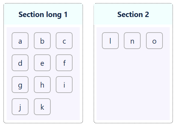
In the initial examples below I’ll assume the following HTML snippet as a base.
|
|
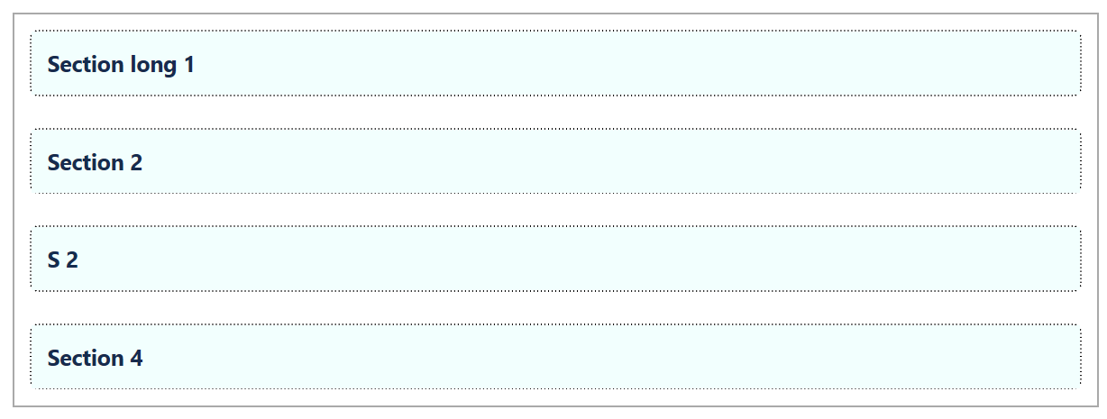
Basic flexbox layout
Use flex-direction to swap between row and column. This indicates direction of items.
|
|
If you line up container divs (i.e. rows in a grid) then you need to think to opposite - the attribute column means your container becomes rows, one of top of the other, in a column.
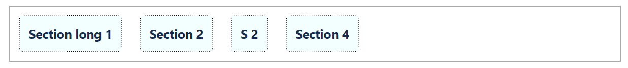
Fill space
As seen in the previous example, the divs are not filling up the whole row. This can be solved by increasing the space between the items using justify-content.
|
|
The result would look like this
Other options instead of space-between are space-evenly, space-around, flex-start and flex-end
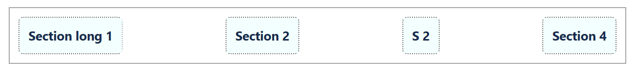
Another way to fill the row is to increase the size of the divs which can be done by adding the flex-grow property.
|
|
The divs are now distributed all over the row.
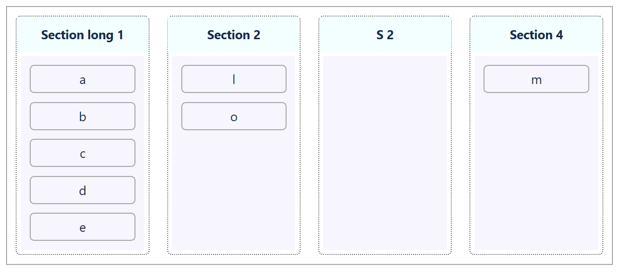
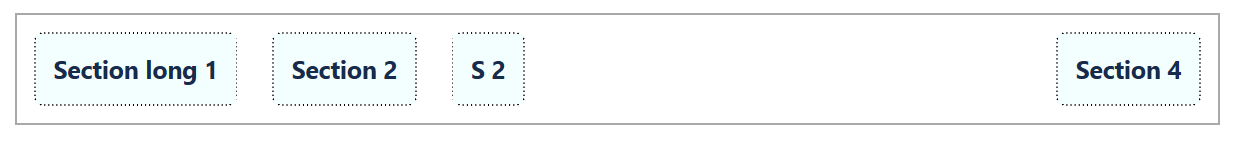
In a practical example we simulate four lists with drag-and-drop behaviour where the purple sections show the droppable areas. However, by default the divs only fill up the area where you have items inside them, which can make a column like S2 difficult to drop items into.
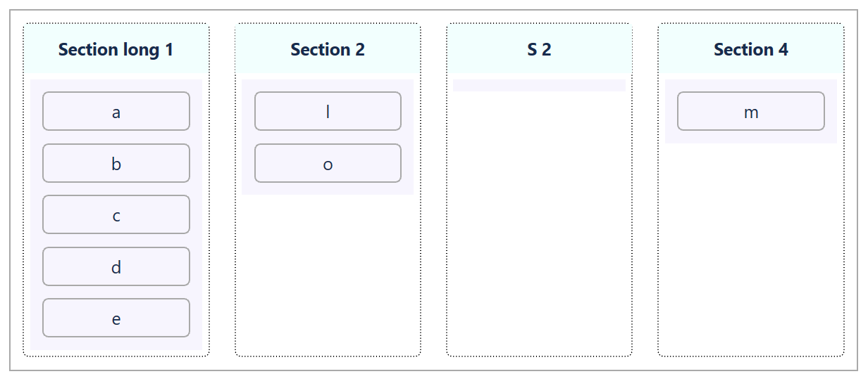
By adding flex-grow: 1 for the purple droppable div, we solve this problem.
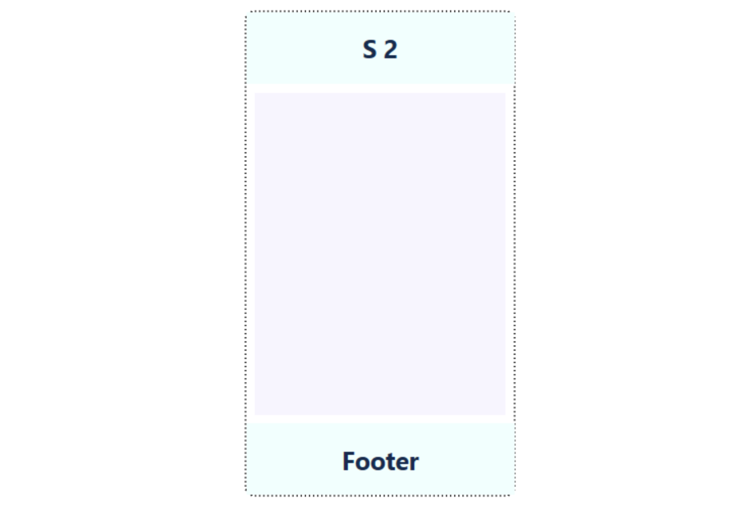
The same technique can be used to push a footer at the bottom of a page, or a card. Simply let the middle content of the item have flex-grow:1 and the footer will be pushed down to the bottom
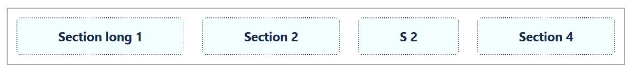
Fill space with same size for all divs
By default, flex-basis is set to auto to adjust for the different size of the elements inside, as can be seen here.
To make all columns have the same width we need to set the flex-basis, forcing all columns to have the same base.
|
|
The result will then look like this
Align content in center
Horizontal alignment has always been easy through auto margin. But vertical alignment has been a pain and always forced me to google it. With flex box style it’s so much easier.
|
|
This is how the titles (and other parts) in the above examples got centered in the middle of the divs
Separate items
Normally, the divs are separated by the same amount of space. But by tweaking the margin, you can change that behaviour.
|
|
Divs overflowing on next row
By default, when flex-direction is set to row then all items are displayed on a single row. To wrap items on several rows, use the flex-wrap setting.
|
|
Any neat Flexbox snippets you think I should add?
Do you have any good suggestions of useful Flexbox examples that you think I should have added? Please write them to the comments below.